
Feast your eyes on these delicious charts
Here are today's specials.
"This is a pie chart describing my favorite bars. And this is a bar graph describing my favorite pies." —Marshall, How I Met Your Mother
We published tens of thousands of charts at Quartz, all in service of explaining the global economy, but only a few that could fairly be described as delicious.
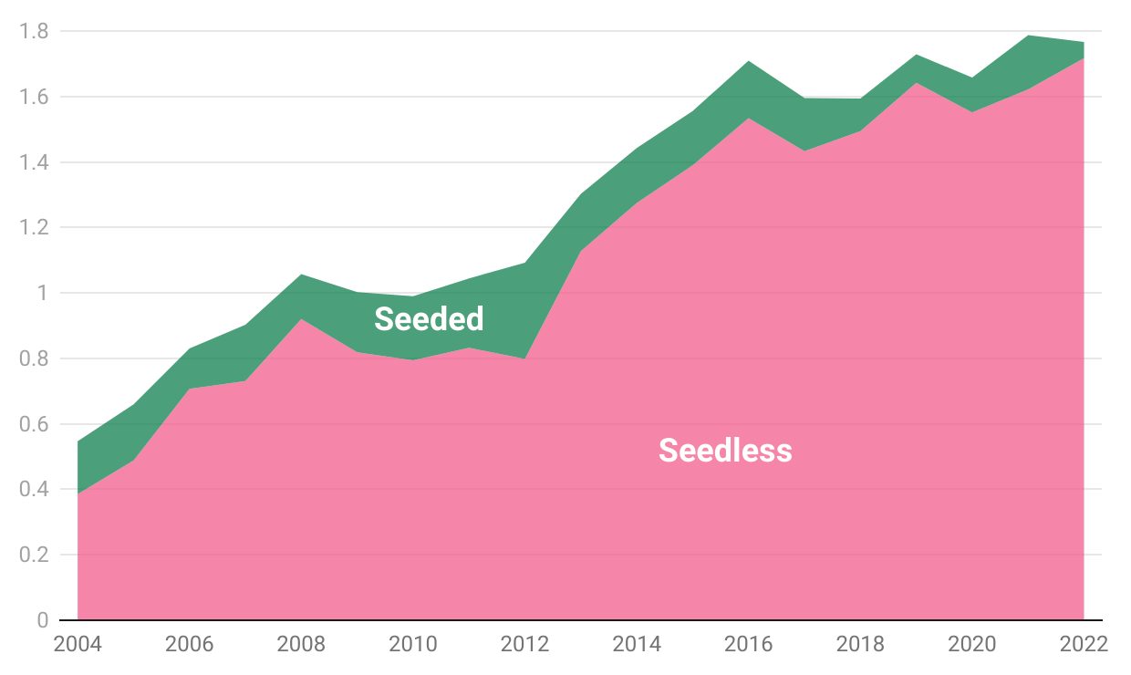
In our first year, I wrote about how seedless watermelons had rapidly overtaken the traditional seeded variety as America's preferred summer snack. Ritchie King whipped up a quick visualization of the trend, which turned out to resemble a fresh slice of watermelon—even more so with the right colors. We went with it, and thus was born my semi-serious obsession with delicious-looking charts.
Because it's summer and why not, I've updated the original chart, using trade data (most watermelons in the U.S. are imported from Mexico) through 2022:
Isn't that a delicious chart?
By the way, seedless watermelons were invented in 1962 by Taiwanese botanist Chen Wen-yu, who became known as the Watermelon King. The trick is to cross pollen with genetically modified watermelon flowers that have twice the normal amount of chromosomes. The result is a sterile fruit with hollow seed skins that are incapable of maturing into hard, black seeds. It's the same breeding process used to make plants like cucumbers and melons, which are part of the same gourd family, easier to eat.
Data visualization that looks like food requires restraint, lest you make a mess of the plate and disgust or, worse, confuse the reader. We only repeated the trick at Quartz a few times, including these two, also by Ritchie, documenting the enduring popularity of mayo and the growing demand for hot sauce in the U.S.:
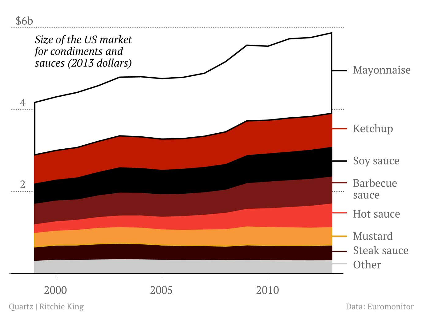
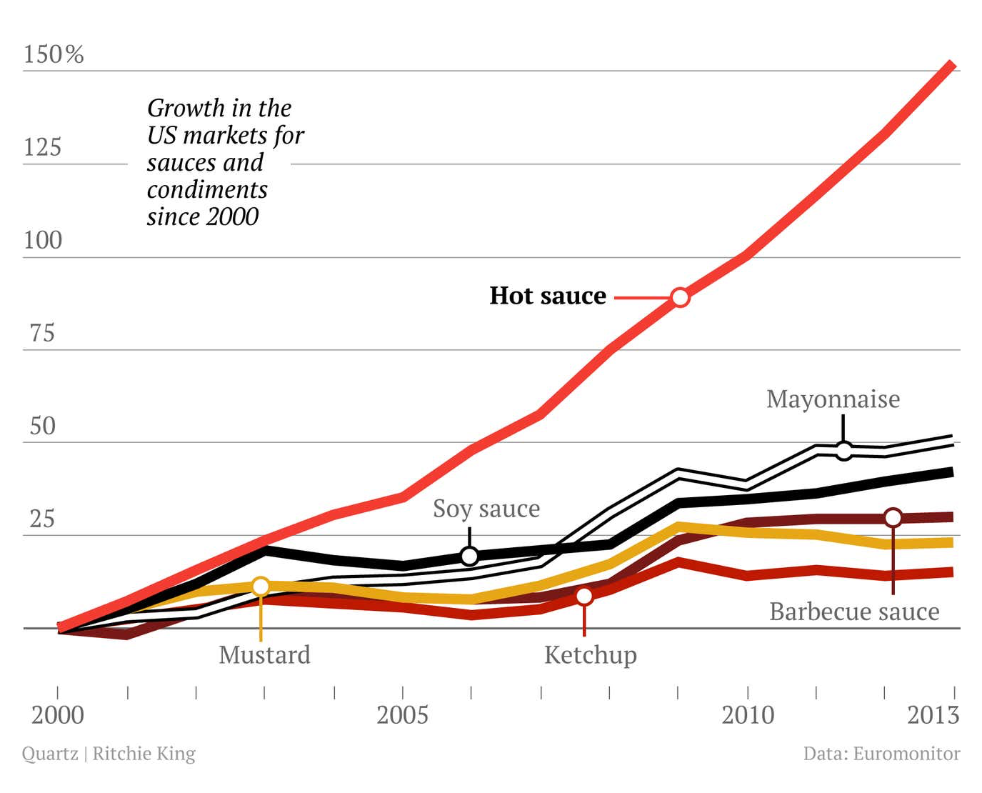
The smears of condiments are evocative and easy to understand, so I think they qualify as delicious, even if you wouldn't combine them all in one meal.
Ever since we published those in 2014, I've kept an eye out for other delicious charts. It's a narrow discipline. The most common example are pie charts about pie, but I have standards and insist, in those cases, that the charts are actual pies. There's a very old meme of this type that's always good for a chuckle, but not delicious. The best I've seen was baked by Melissa Wakefield, who visualized the results of an NPR poll about listeners' favorite varieties of pie:
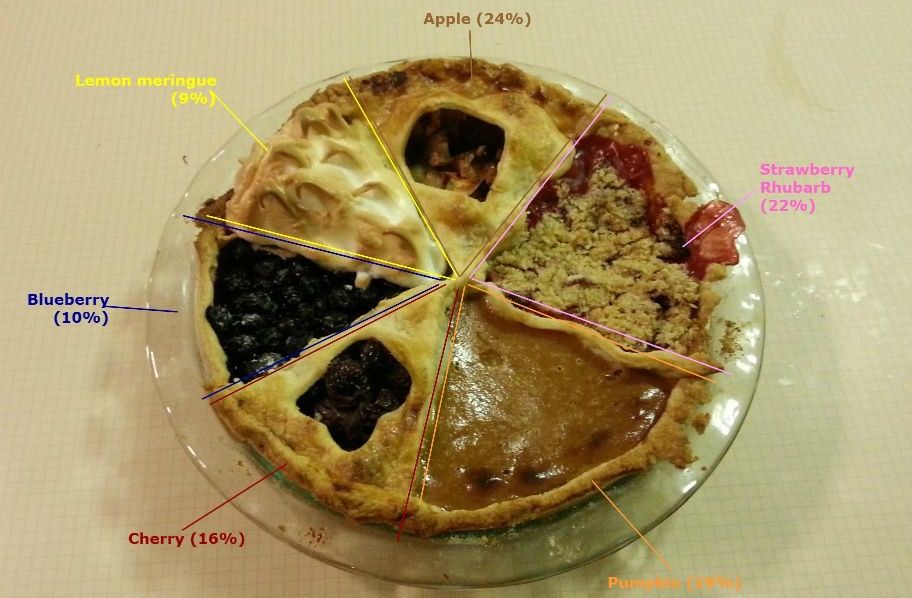
What the pie sacrifices in accuracy—Wakefield was smart to omit chocolate cream pie and "other" from the results—it more than compensates for by utilizing a single pie crust with multiple fillings applied at different times in the baking process. It's one pie! And it actually looks delicious! (I've yet to see a doughnut chart made of doughnuts, but it seems like a promising concept, just saying.)
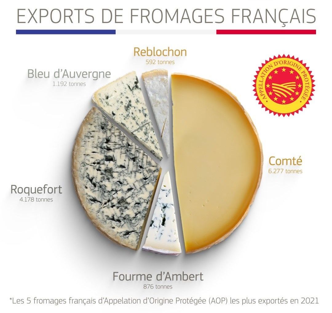
Just the other day, the director-general of the European Union's trade department tweeted an edible chart of French cheese exports. Befitting its bureaucratic origins, the chart only counts cheeses with the E.U.'s "protected designation of origin" (AOP), so Camembert and Brie don't make the cut, which is confusing. The data would also be easier to understand as a bar chart or plain-old table. But the E.U. gets a pass from me because cheese wheels are circular, and the resulting visualization is undoubtedly delicious, assuming you don't mind blue cheese.
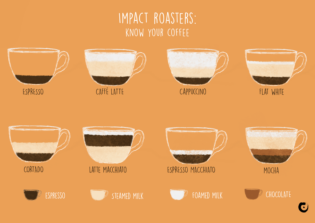
Let's finish this meal with coffee.
There are many, many versions of this visualization floating around the web, most of them uncredited, ugly, or both. I found a decent version by the Danish coffee company Impact Roasters. But regardless of the aesthetics, it's a genuinely smart way to explain various espresso-based drinks, using the relative proportions of their ingredients, which makes this a delicious chart by my standards.
Cheers!

Read more from Zach
Sign up to receive occasional emails with new posts.